
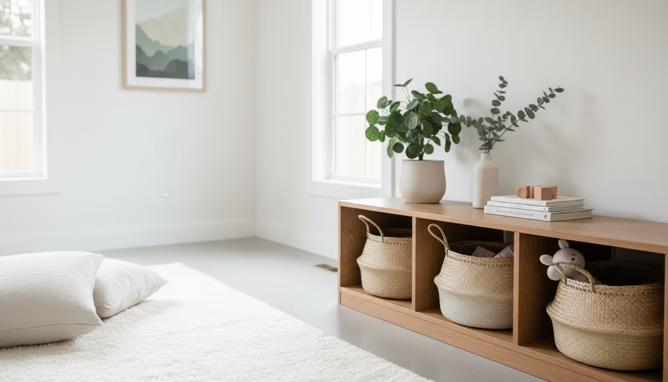

The instinct in decorating and organizing a home is to fill — to put something on every shelf, cover every surface, use every corner. Applied consistently, that instinct produces a home that is technically full but not restful: the eye has nowhere to land, the brain takes in constant visual information, and the calm a home is supposed to provide gives way to a low sense of being surrounded.
Empty space is not the absence of design. It is a design element in its own right — one that takes deliberate choice to include in a culture that treats fullness as the default setting.
What empty space actually does
In visual perception, empty space does two jobs: it rests the eye, and it gives context to whatever sits near it. A single ceramic vase on a clear shelf reads completely differently from the same vase on a shelf crowded with a dozen other objects. The space around it directs attention, frames it as an intentional choice, and lends it a visual weight it could never have in a crowd.
Retail and gallery design lean on this on purpose. A boutique sets one handbag on an otherwise bare pedestal; a gallery gives a single canvas an entire wall. Products and artwork shown with room around them are read as more valuable than the same items packed tightly together. The empty space is not neutral or wasted — it is actively shaping how the thing beside it is perceived.
How to tell a room has too much in it
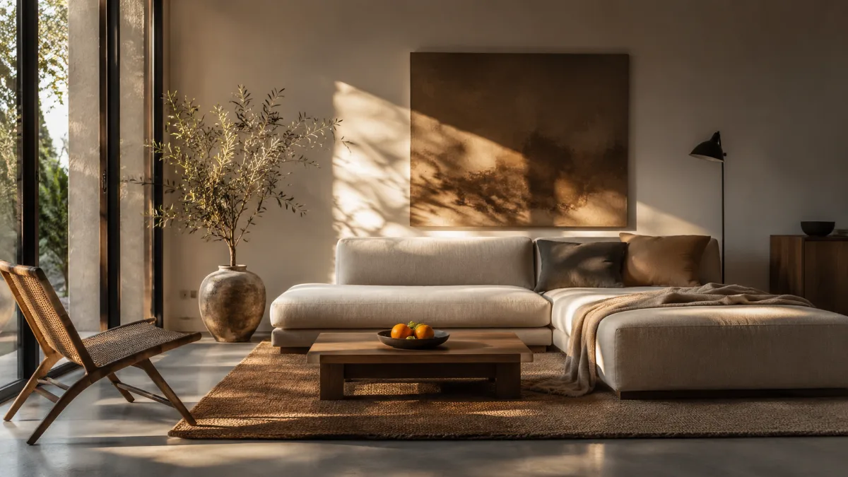
The diagnostic question is simple: can you name, clearly and immediately, the focal point of the room? In a living room that is usually the main seating group or an architectural feature — a fireplace, a window. If answering requires scanning the room because everything competes for attention at the same volume, the room is holding too much.
Every additional object is a candidate focal point, one more thing pulling at the eye. A room where twenty things compete produces visual noise in which nothing reads clearly. A room where most surfaces are clear lets the few deliberately placed pieces register exactly as intended. The test is not how many things you own, but how many are on display at once.
A quick way to see it is a photo. Stand in the doorway and take one picture of the room on your phone. A photograph flattens the space and strips away the familiarity that lets you overlook the pile on the sideboard or the row of bottles on the mantel. Details the eye glides past in person jump out in the frame, and the shot usually shows two or three surfaces carrying far more than they need to.
Three checks turn a vague feeling into something you can act on. First, count the objects on each horizontal surface: a coffee table with more than 3 items and a kitchen counter with more than 5 read as cluttered to most people, regardless of how tidy those items are. Second, look at the walls — when more than about 60 percent of wall space carries something, the room feels busy even when the floor is clear. Third, check floor clearance: main walking paths need 30 to 36 inches, and anything narrower makes a room feel smaller than its measurements.
Photograph the room on your phone and look at the photo instead of the room. A camera flattens the space and shows the visual load your eye has learned to filter out — it is the fastest diagnostic in this list and costs nothing.
Practical empty space, room by room
In the living room, empty space lives on surfaces: a coffee table cleared to one or two intentional objects, bare end tables, shelves holding fewer pieces with more air between them. The count does not have to reach zero — it has to reach the point where each object has enough breathing room to be seen rather than blur into a mass. A bookshelf with three-quarters of its run filled and a few open gaps reads as curated; the same shelf packed edge to edge reads as storage.
In the bedroom, clear floor around the bed, empty nightstands, and a dresser top holding only what is used daily create the restful setting that supports good sleep. A bedroom full of visual clutter keeps the brain mildly alert; one with clear surfaces and open floor gives the visual rest that helps the mind wind down. The Sleep Foundation's guidance on sleep hygiene consistently points to a calm, uncluttered bedroom as part of the environment that makes falling asleep easier.
In the kitchen, empty counter is the functional twin of clear desk space in an office: the work surface that makes the task possible. A counter buried under small appliances, cookbooks, and accumulated odds and ends offers nowhere to actually prep. A counter holding the coffee maker and nothing else gives the whole run back to cooking.
The entryway deserves the same treatment, since it sets the tone for the whole home the moment anyone walks in. A console table left clear except for a single tray for keys reads as calm; the same table buried under mail, sunglasses, and loose change reads as the drop zone it has become. In a home office, a desk that ends each day clear of everything but the monitor makes the next morning's start noticeably easier, because there is no small tidying tax to pay before real work can begin.
Useful targets, room by room: keep one third of every shelf empty; leave at least one full wall without furniture against it; keep the surface beside the cooker and the surface beside the sink completely clear, because those two are working areas rather than storage; keep the floor under and around the bed clear so the room reads as larger; and leave one drawer in the kitchen and one shelf in the entryway genuinely empty, as landing space for the things that arrive during the week.
The last one is the most useful and the least intuitive. A designated empty shelf absorbs the mail, the school forms and the parcels that otherwise colonise the dining table, and it can be cleared in 2 minutes because everything on it arrived within the last few days.
The fear of empty space
The reluctance to leave anything empty usually traces back to a cultural equation: full means warm, empty means cold. A home with bare walls and bare surfaces can read as cold — but the opposite of full is not empty, it is selective. A room with three carefully chosen objects on its visible surfaces is neither cold nor cluttered. It is designed.
Getting there means passing through a stage that feels too sparse, where things have been removed but the rightness of the smaller number has not settled in yet. That stage is temporary. The eye adjusts to less information and starts reading the remaining objects more clearly; the brain stops producing the faint alertness that visual overload creates and settles into the rest that open space allows. Most people who sit with the change report that the room feels more comfortable after two or three weeks than it did full, even though there is visibly less in it.
Creating empty space without decluttering
The fastest route to more empty space is not decluttering but relocating — moving objects from open surfaces into closed storage. A shelf cleared by shifting its contents into a drawer produces the same visual result as one cleared by removing things from the home entirely. For a household not ready to part with possessions permanently, relocation delivers the visual change immediately and buys time to judge whether the stored items are missed.
That judgment tends to answer itself. Anything relocated to a bin or drawer and neither accessed nor missed within a month is a strong candidate for permanent release: its absence from view left no functional gap, which is most of the evidence needed. The reverse is worth noticing too — the handful of things you do reach back for are exactly the ones that earned their spot on the surface in the first place.
Empty space makes maintenance easier
Clear surfaces and open floor pay off beyond how they look: they make cleaning faster. A countertop with two objects wipes down in seconds; one with twelve requires moving each item or wiping around it. An open floor sweeps in a single pass; a floor dotted with objects means navigating around every one. That cost — a few extra seconds per object, several times a week — compounds quietly across a whole home and a whole year. Empty space largely maintains itself, which stacks the benefit over time. A cleared surface also resists new clutter: an object left on a bare, deliberate tabletop looks out of place and tends to get put away, while one more item on an already crowded shelf disappears into the pile and stays.
Start with one surface
The most approachable way in is a single surface: one nightstand, one section of counter, one shelf. Clear it completely, return only what is genuinely used daily in that spot, and live with it for a week. The small experiment gives a direct, low-stakes feel for what less visual information does in that specific space, with no household-wide commitment required. That one cleared surface becomes both a practice run and a reference point — proof of how the pared-back version looks and feels day to day, which makes the next surface far easier to commit to and to keep that way.
The three audits, with thresholds:
| Audit | Threshold |
|---|---|
| Horizontal surfaces | coffee table >3 items = busy |
| Walls | >60% covered reads crowded |
| Walking paths | 30–36 in minimum |
| The release valve | one designated empty shelf absorbs the daily influx |


Comments
No comments yet.