
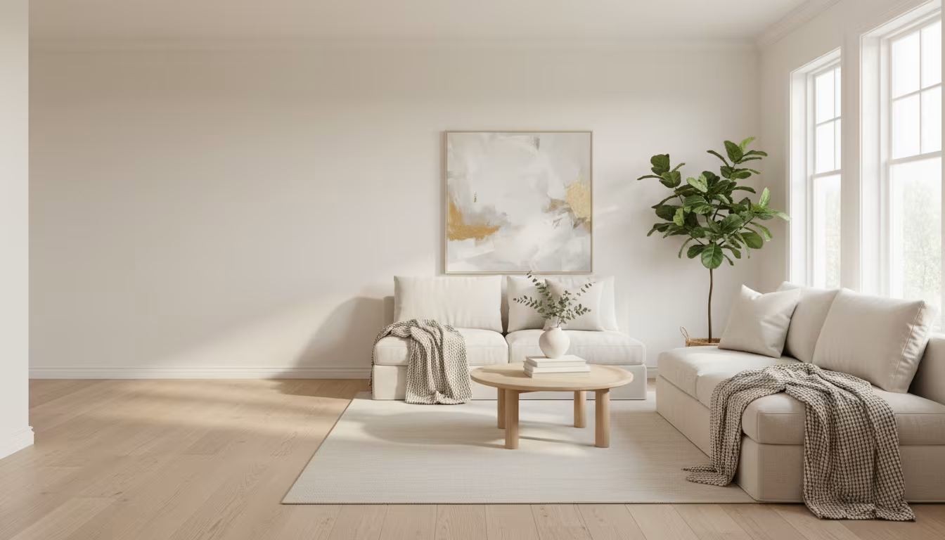

The instinct with a bare wall is to fill it — to keep hanging things until the wall looks "done." The trouble is that a full wall reads as busy rather than finished. When art, mirrors, shelves, and objects cover every vertical surface, they start competing with each other and with the furniture, and the quiet that empty wall space provides disappears. The room looks stocked, not designed.
Minimalist wall decor is not bare walls. It is a selective approach: fewer pieces, chosen with more care, placed with attention to spacing, and given room to breathe so each one actually registers. The point is impact through restraint rather than coverage.
One Statement Piece Per Wall
A workable rule for any wall you plan to decorate: one statement piece, and let everything else support it. The statement is the anchor — the painting, the large mirror, the oversized print your eye lands on first. Anything else you add to that wall either reinforces the anchor or fights it, and most of the time it fights.
A single well-chosen piece, centered, hung at the right height, with clear space around it, makes most walls feel complete rather than sparse. The urge to add a second and third piece usually comes from the wall reading as "not enough" in the moment you are hanging it — a feeling that resolves on its own once the furniture, plants, and everyday objects fill in the visual context and your eye adjusts to the room as a whole.
Scale is what makes the single piece work. A common error is hanging something too small for the wall, which looks tentative and invites you to crowd more around it to compensate. A large living-room wall behind a sofa generally wants a piece roughly two-thirds to three-quarters the width of the sofa — one substantial 36-by-48-inch canvas reads as intentional where four small 8-by-10 prints scattered across the same space read as filler. When in doubt, go one size up rather than one size down; a piece that feels slightly bold on the floor almost always settles into the wall once it is up. Much of this echoes University of Tennessee Extension.
Gallery Walls Without the Chaos
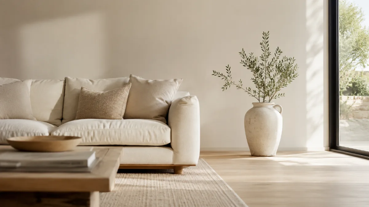
A gallery wall can still be a minimalist choice, as long as it is treated as one composed unit rather than a collection that keeps growing. The version that works has defined edges — a clear place where it starts and stops — consistent or deliberately varied spacing between frames, a limited frame palette (all black, all natural wood, or all white reads far cleaner than a mix of metal, wood, and painted frames), and a restrained count. Five to nine pieces is a practical range; past twelve it starts to feel accumulated rather than arranged.
A gallery wall that expands over the years with no edge and no plan drifts toward visual noise no matter how good the individual pieces are. Once it stops feeling curated and starts feeling collected, it works against the calm it was meant to create. If you want a gallery wall that can grow, decide the outer boundary in advance and only rearrange within it, rather than letting the arrangement creep outward frame by frame.
Texture Over Color, and Space as a Tool
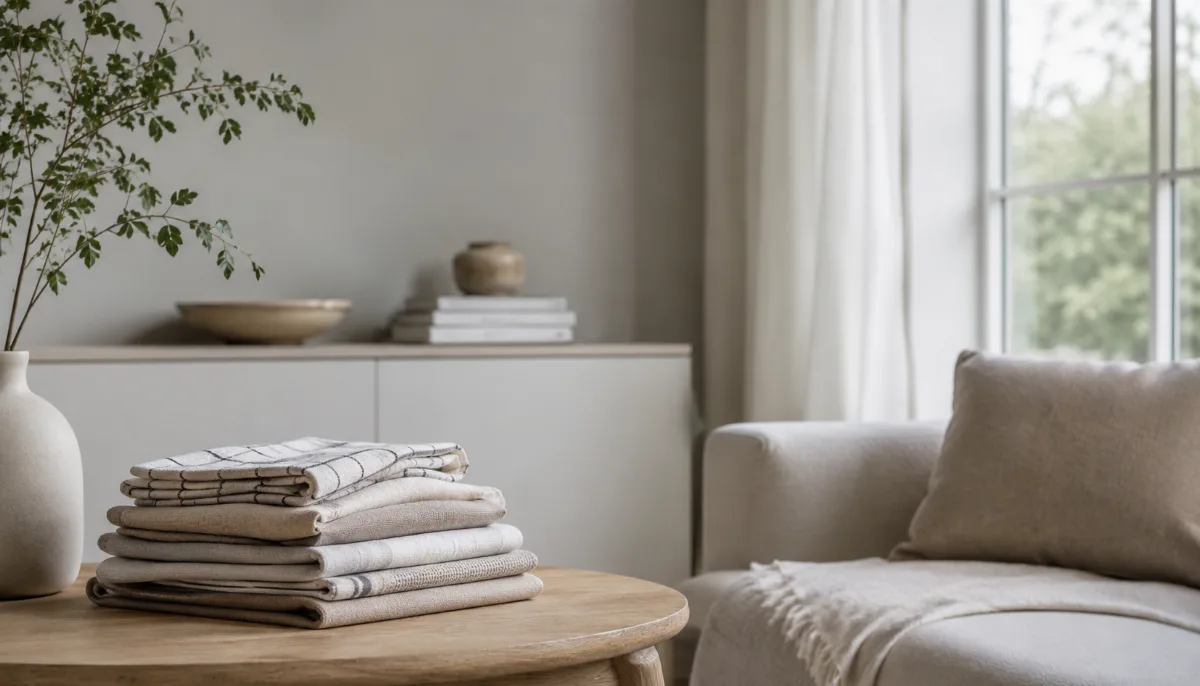
Minimalist wall decor tends to lead with texture and material rather than strong color: a linen hanging in neutral tones, a woven basket used as an object, a piece of raw wood or stone, a black-and-white architectural photograph, a simple print in earthy tones. These add depth without the visual competition a bold, highly detailed artwork creates in a room that already has other things going on. It is not about draining color from the space — it is about putting the color in movable elements like pillows, throws, ceramics, and books, which you can swap out cheaply, while the fixed wall pieces contribute form and texture.
The empty space around a piece is as much a design element as the piece itself. A medium print centered on a large wall with substantial clear space on every side carries a visual weight it would never have crammed into a tight cluster. Deliberately leaving part of a wall bare feels counterintuitive while you are decorating, but it is often the exact decision that makes the rest of the room read as intentional rather than accidental.
Get the Height Right
Hanging art too high is the single most common mistake, and it disconnects the piece from the furniture below so it looks like it is floating. The fix is straightforward: aim for the visual center of the piece at roughly eye level in standing spaces, and closer to the furniture when the art hangs above it. Treat a grouping as one unit — the center of the whole group sits at the target height, not the center of each frame — and lay the arrangement out on the floor first to avoid a wall full of trial holes.
| Situation | Where the visual center goes |
|---|---|
| Standing spaces (entry, hallway) | About 57–60 inches from the floor |
| Above a sofa or console | About 8–10 inches above the furniture top |
| A grouping of several pieces | Group's combined center at the height above |
| Above a bed or headboard | Centered on the bed, a few inches above the headboard |
Remove First, Then Decide
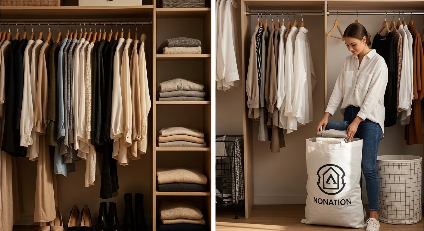
For a room whose walls already carry too much, the most effective move is not swapping pieces around — it is taking everything off one wall, living with it blank for two weeks, and only then asking what, if anything, should go back. Deciding while the wall is still full gives you a distorted read; the empty wall gives you an honest one.
Whatever you took down and did not miss across those two weeks does not need to return. Whatever you actively missed has proven its decorative worth and can go back up. That real-world test tells you more than any theory about what a wall "should" hold, and it usually sends less back to the wall than you expected — which is the whole point.


Comments
No comments yet.